Vietaste Restaurant
Brand Identity
This project was a group project while I was at Arena Multimedia, where we had to develop a brand identity for an imaginary brand.
The project has achieved a mark of 89.7/100 - the highest in class and was on the best project shortlist (2016-2017) of Arena Multimedia.
The project has achieved a mark of 89.7/100 - the highest in class and was on the best project shortlist (2016-2017) of Arena Multimedia.
Brand concept
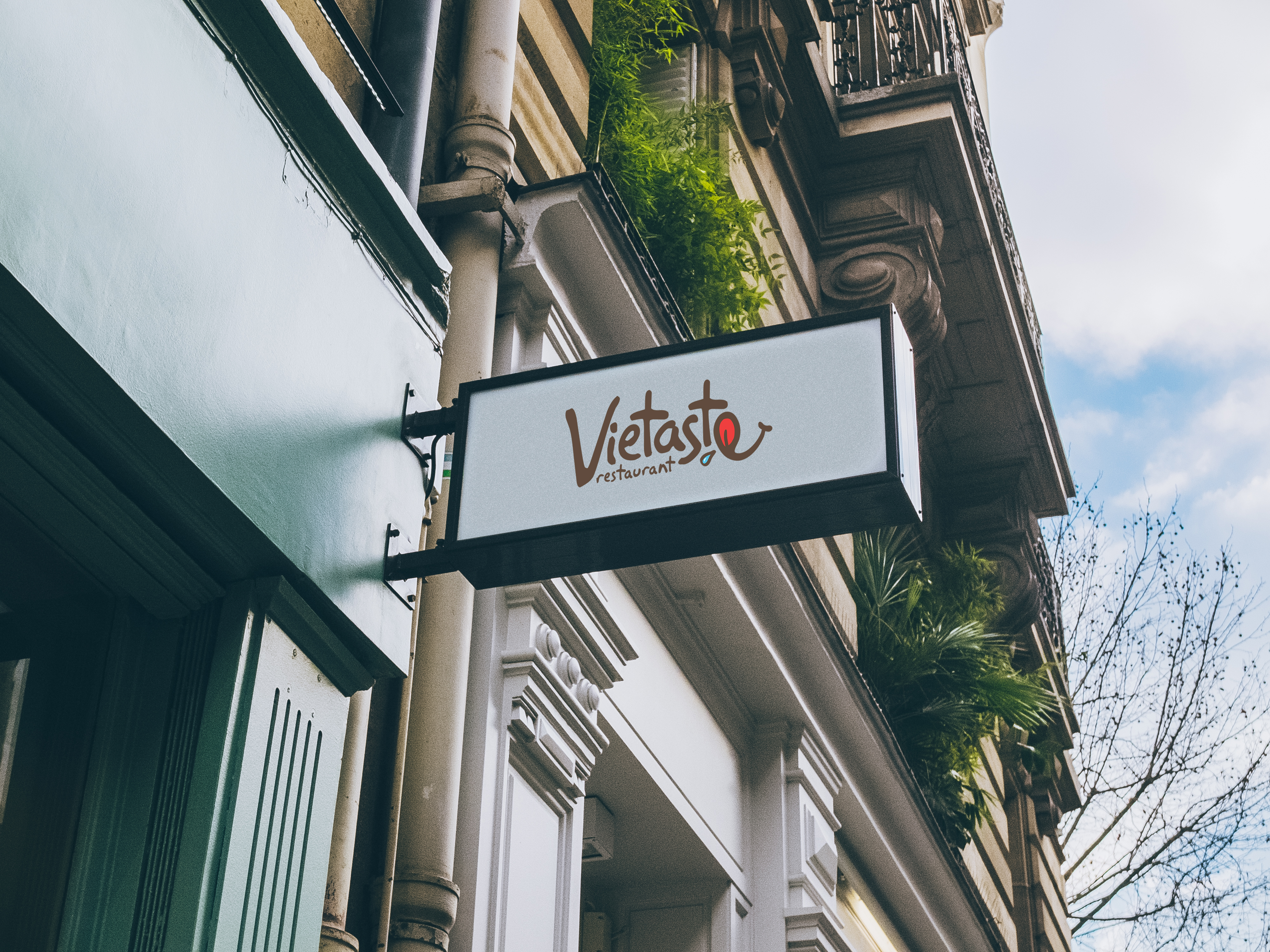
Vietaste Restaurant was a Vietnamese restaurant that combined traditional and modern values. Our target audience was young adults from 18 to 25. They had a love for Viet cuisine, but easy to lose their interest in traditional values.
Vietaste Restaurant was a Vietnamese restaurant that combined traditional and modern values. Our target audience was young adults from 18 to 25. They had a love for Viet cuisine, but easy to lose their interest in traditional values.
Our strategy was to attract more young people to Viet food by building a visual system that expresses more vibrance and dynamism, but still honors Viet culture.
Visual system and package
Typefaces & Color Palette
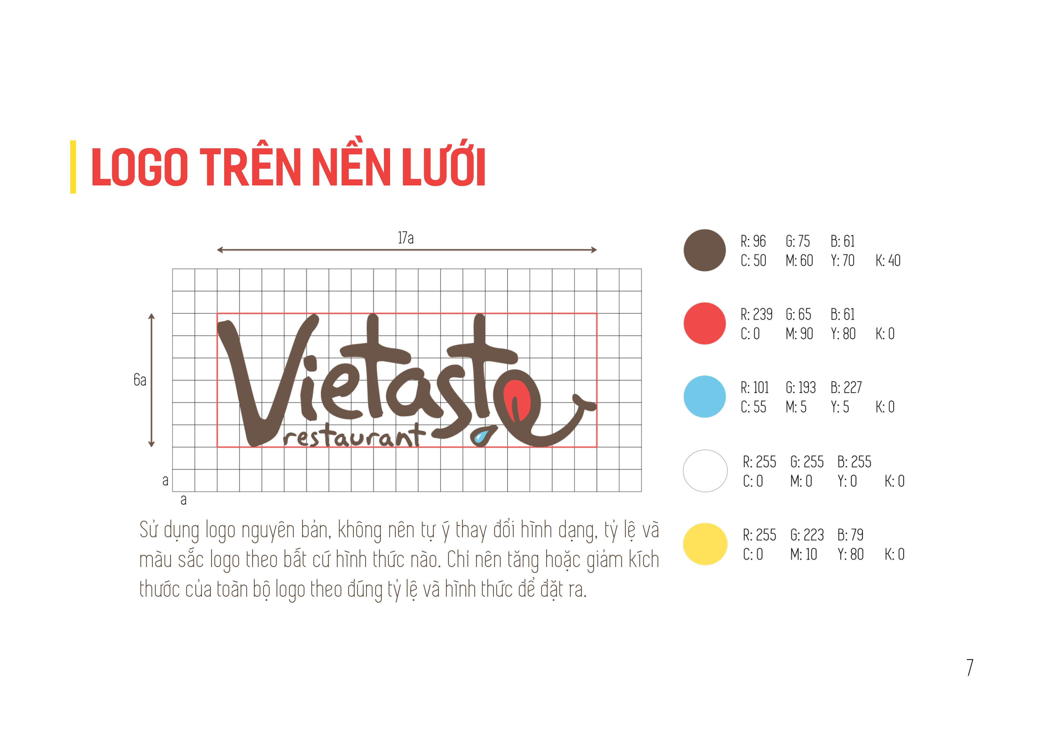
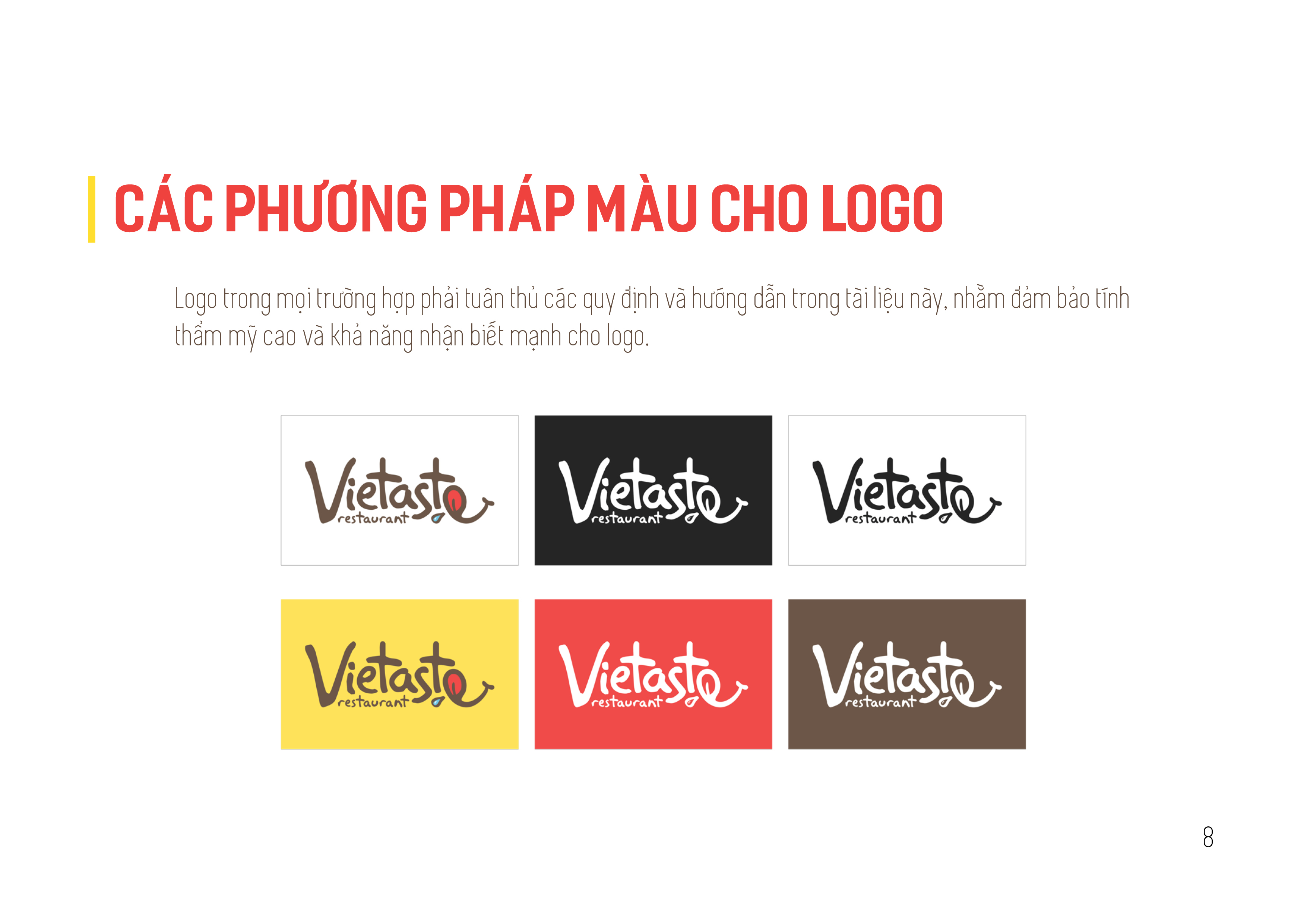
We still retain our Viet identity by modifying the Viet flag colors, red and yellow, as our primary colors. We also added brown to the color palette as a contrast to vibrant red and yellow to evoke a feeling of nature and originality.
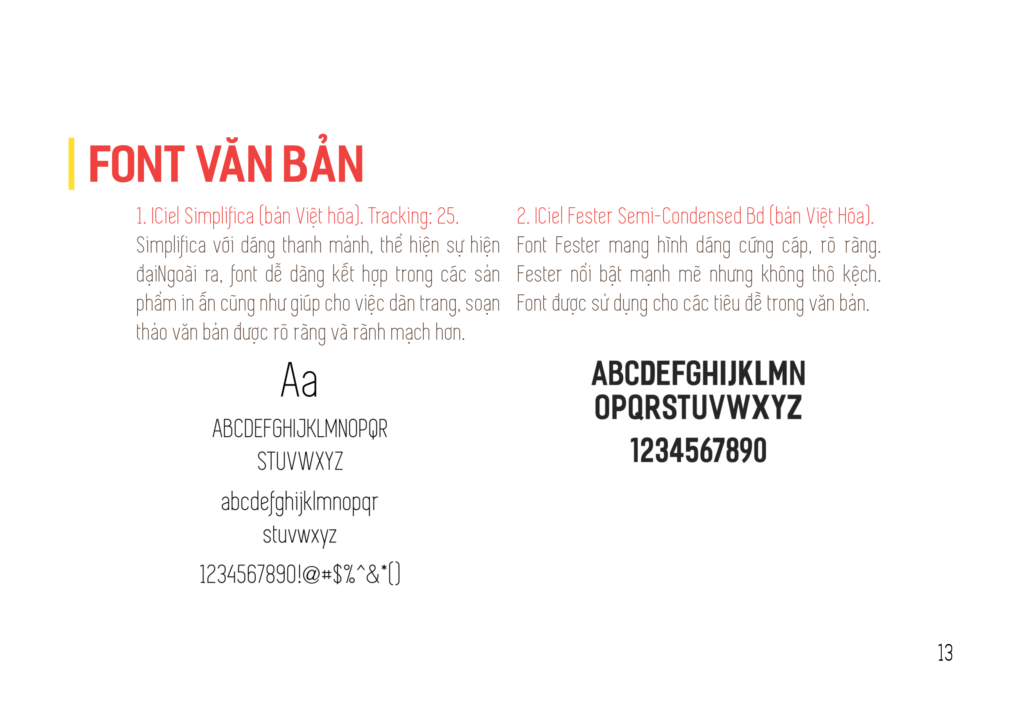
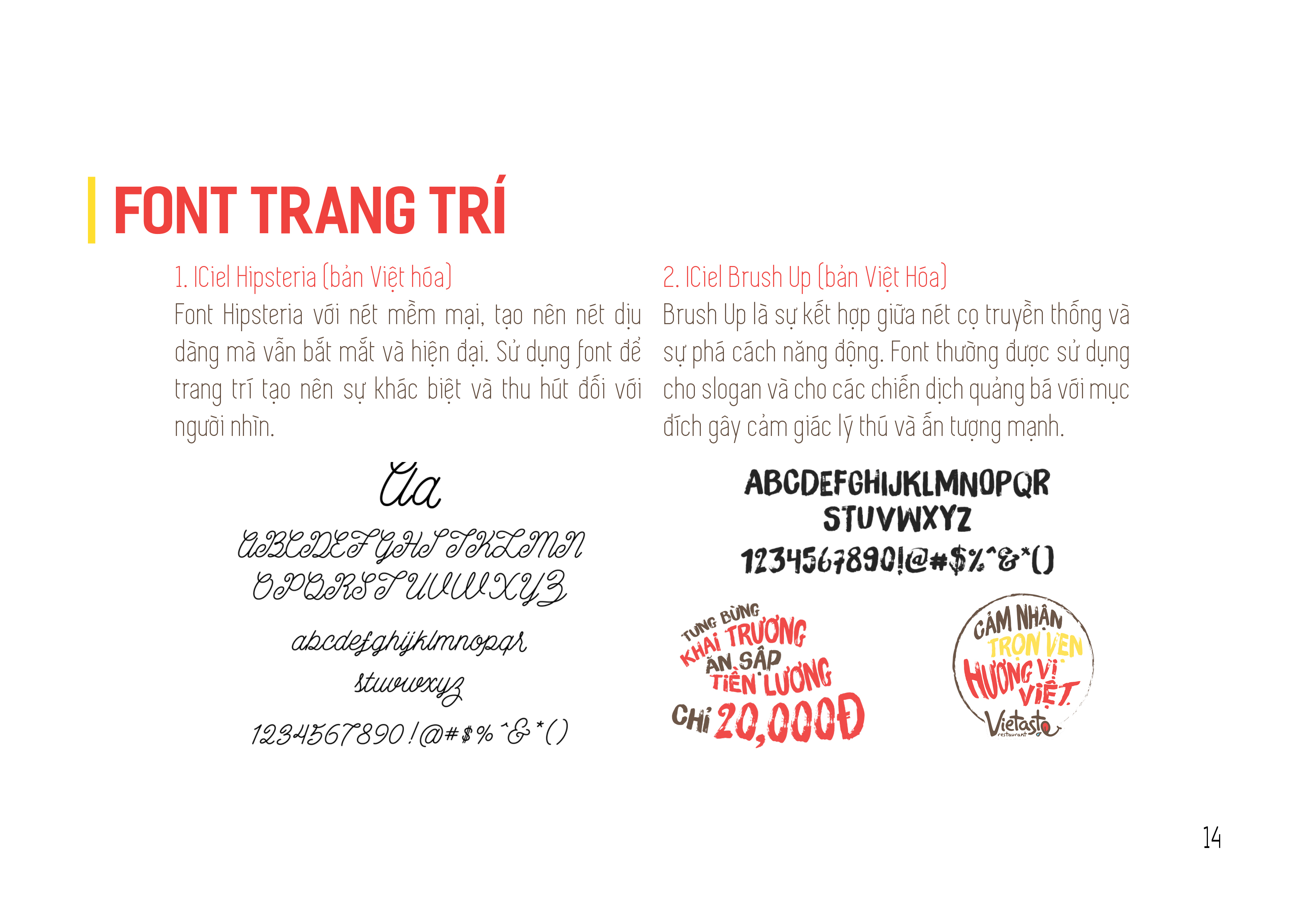
There was also a mixture of modern and traditional in the usage of typefaces, where we tried to combine sans-serif and brush script typefaces in our identity package.
We still retain our Viet identity by modifying the Viet flag colors, red and yellow, as our primary colors. We also added brown to the color palette as a contrast to vibrant red and yellow to evoke a feeling of nature and originality.
There was also a mixture of modern and traditional in the usage of typefaces, where we tried to combine sans-serif and brush script typefaces in our identity package.
Symbol and Illustrations
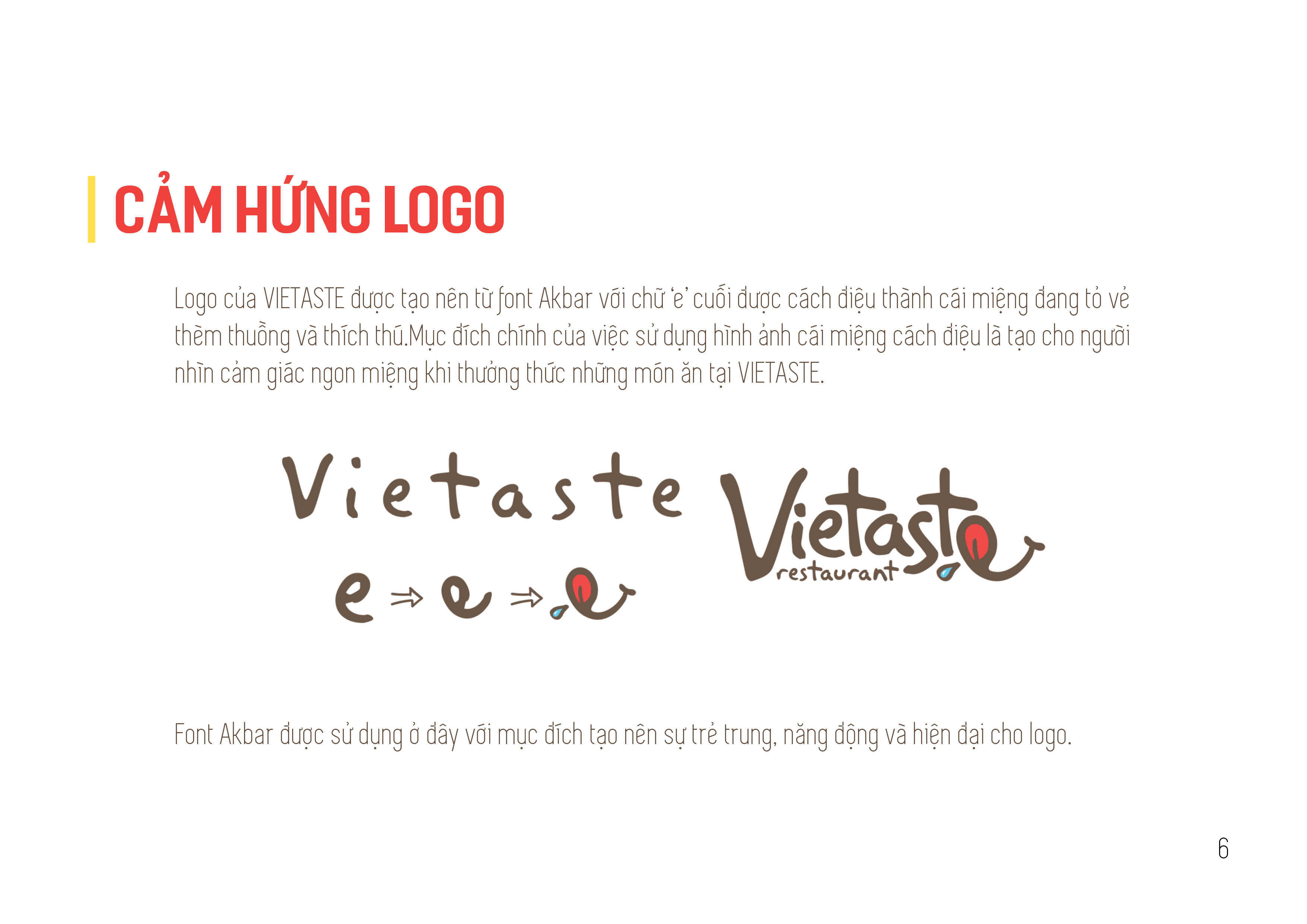
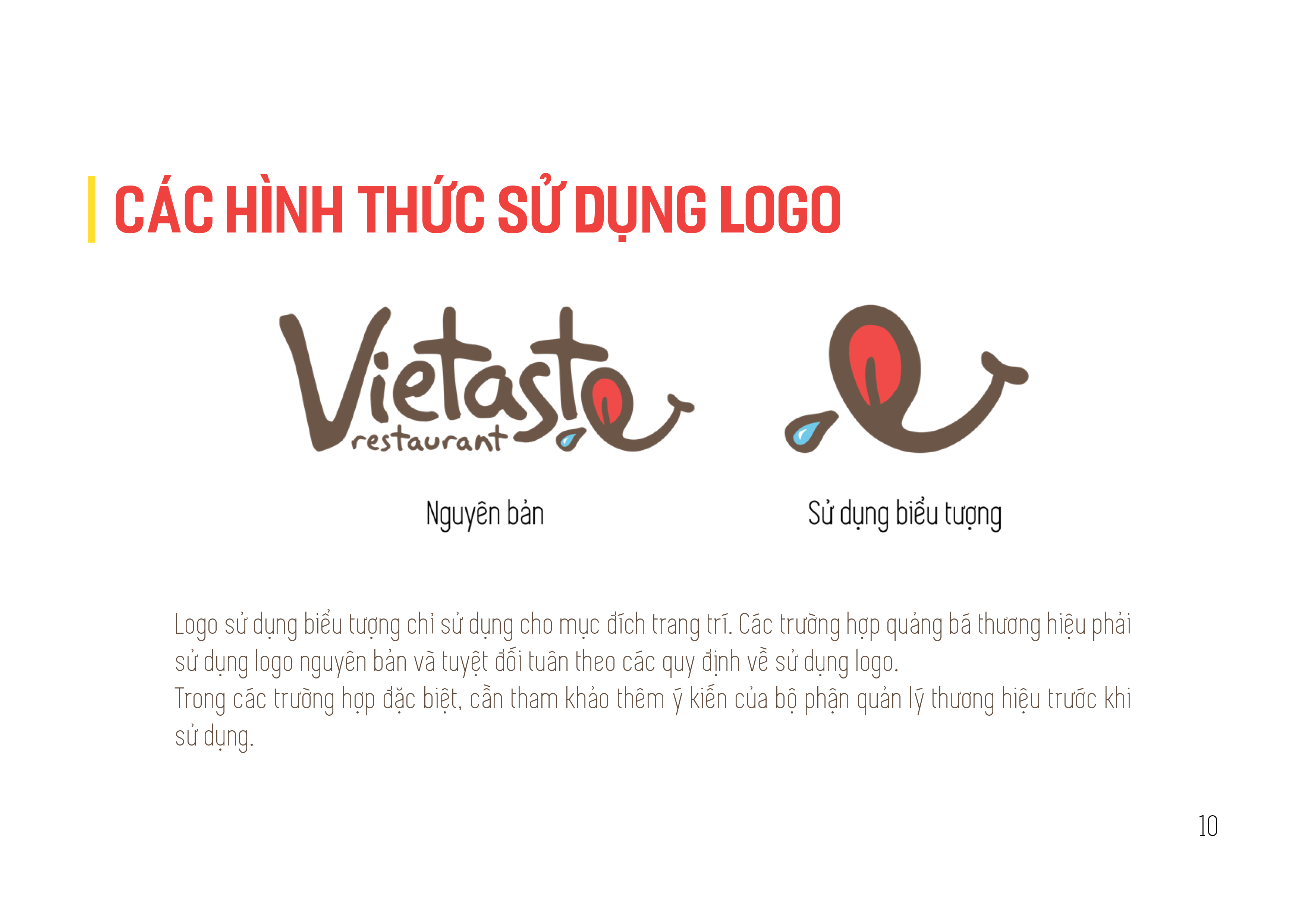
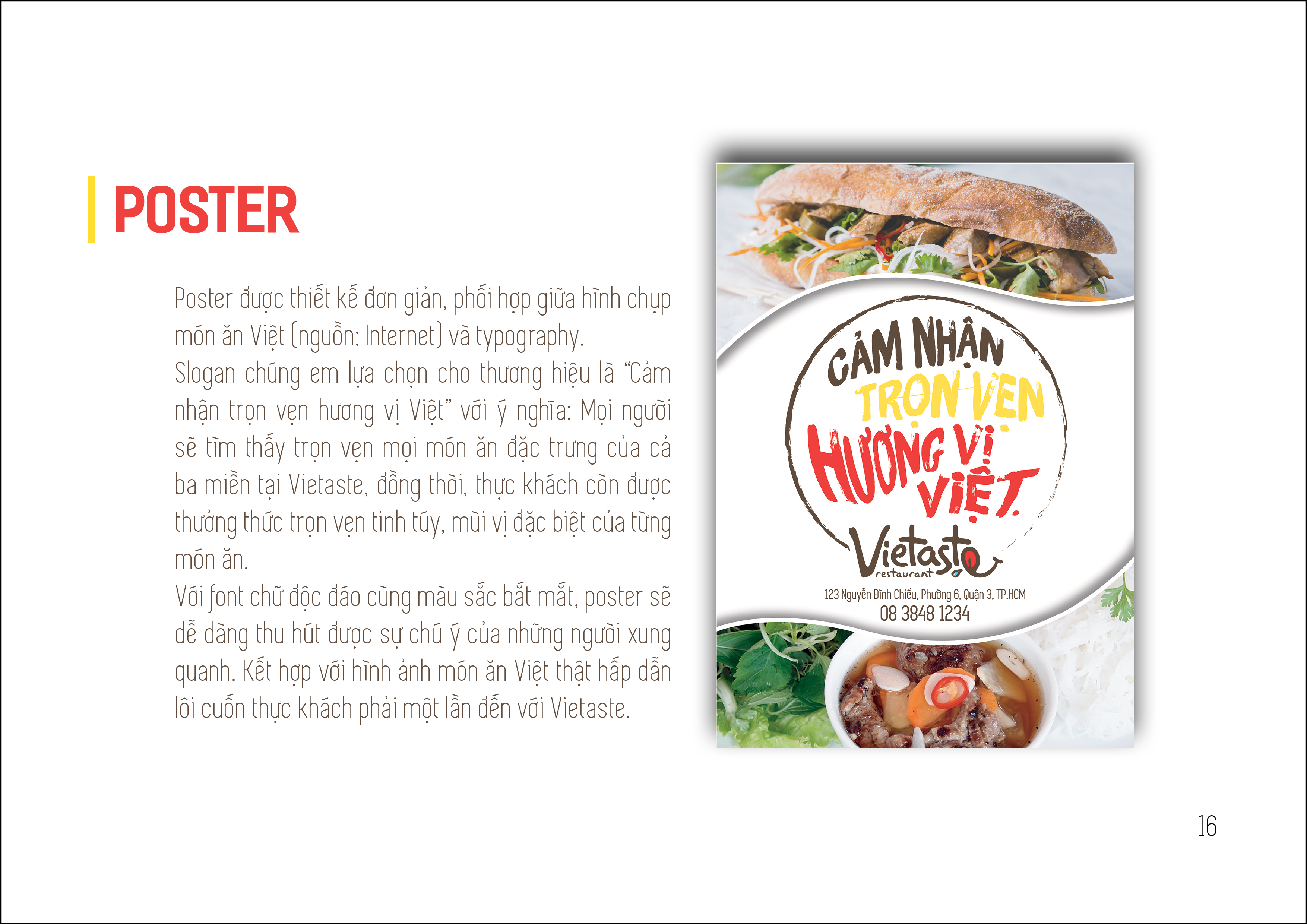
For decoration purposes, we transformed the letter 'e' from the brand name - Vietaste into a tongue symbol to enhance the target audience's appetite. Symbols like the tongue one contributed to the funky and youthful identity of Vietaste. In contrast, we highlight the quality of traditional Vietnamese food by using stunning food photographs from qualified sources.
For decoration purposes, we transformed the letter 'e' from the brand name - Vietaste into a tongue symbol to enhance the target audience's appetite. Symbols like the tongue one contributed to the funky and youthful identity of Vietaste. In contrast, we highlight the quality of traditional Vietnamese food by using stunning food photographs from qualified sources.
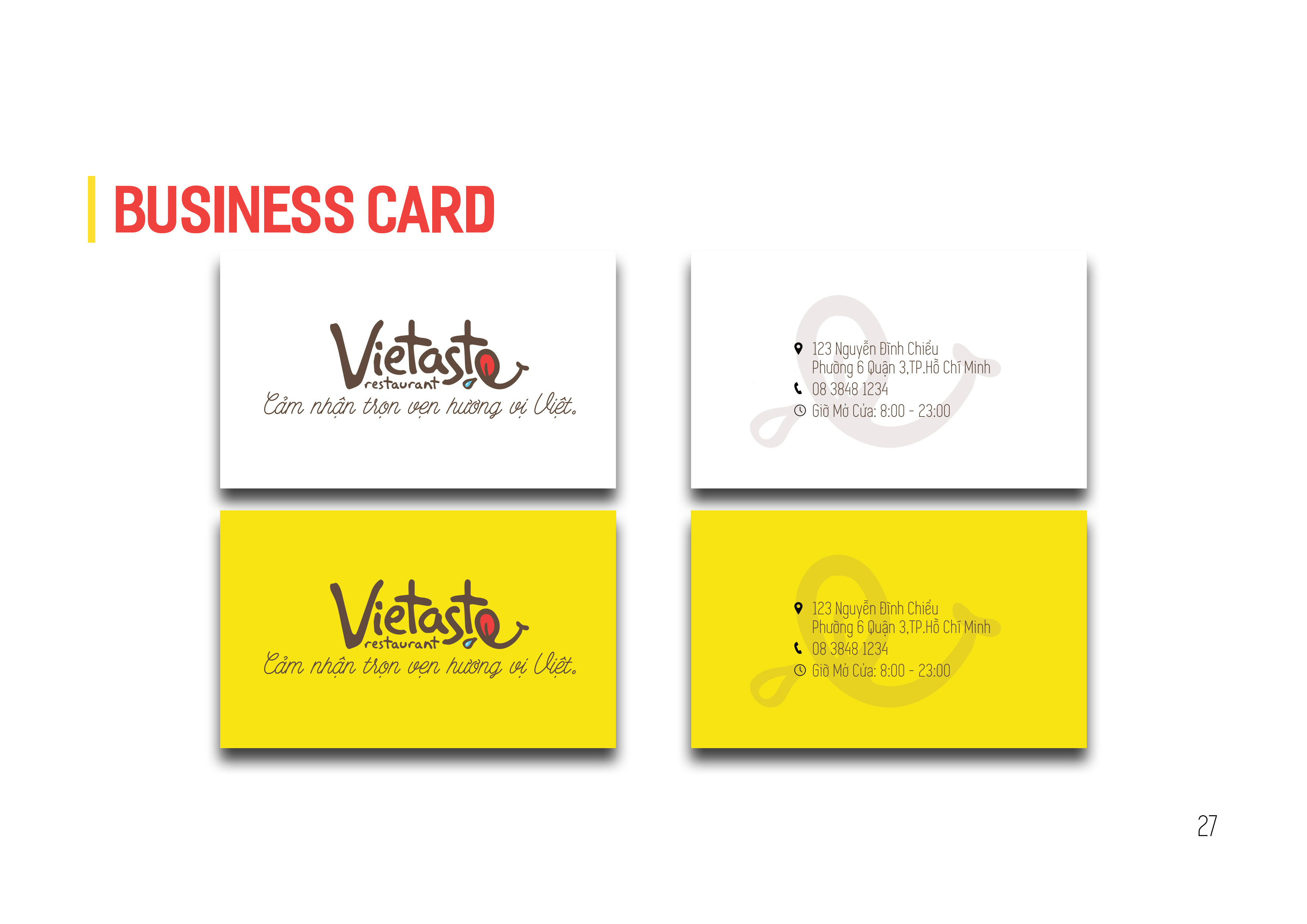
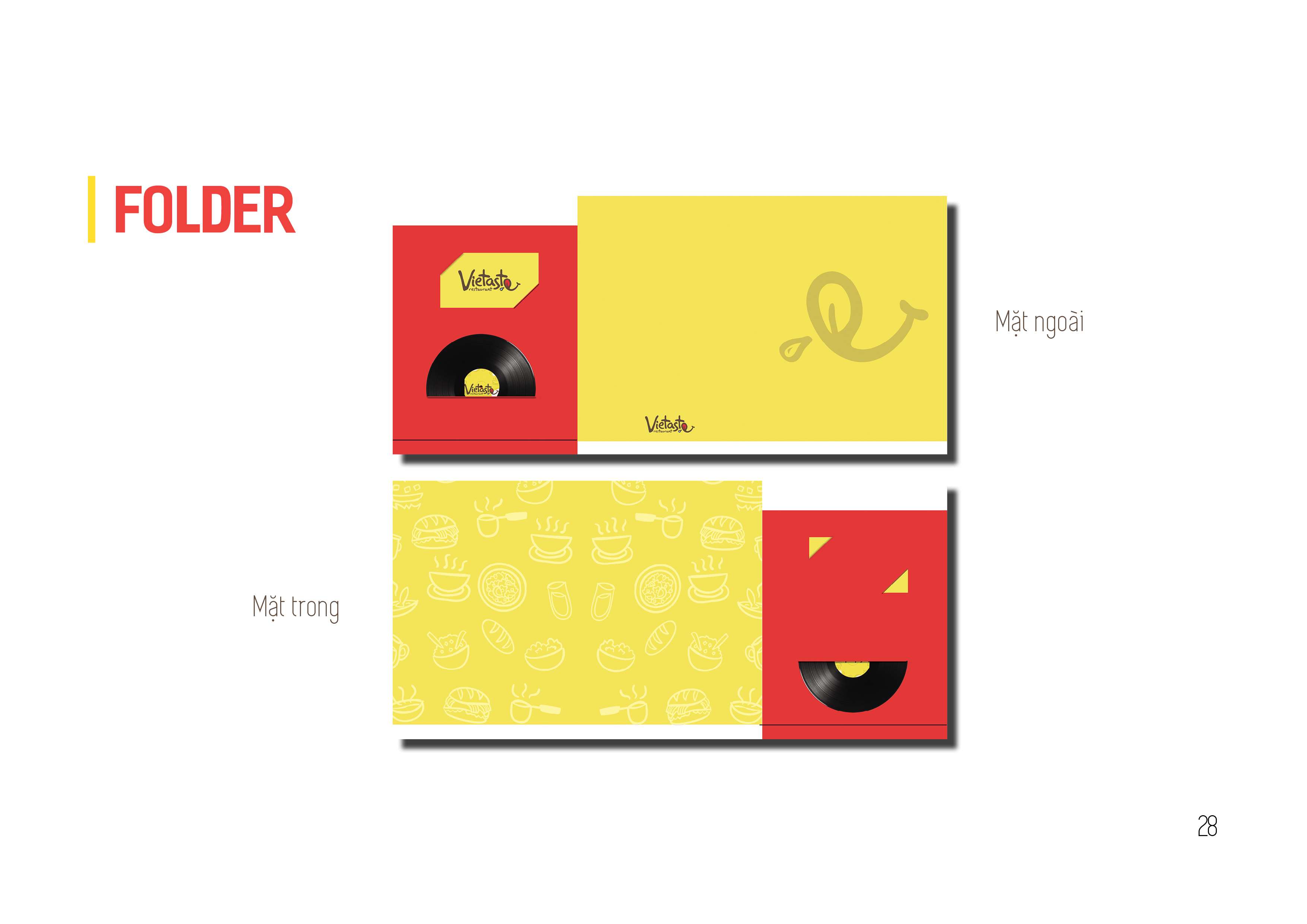
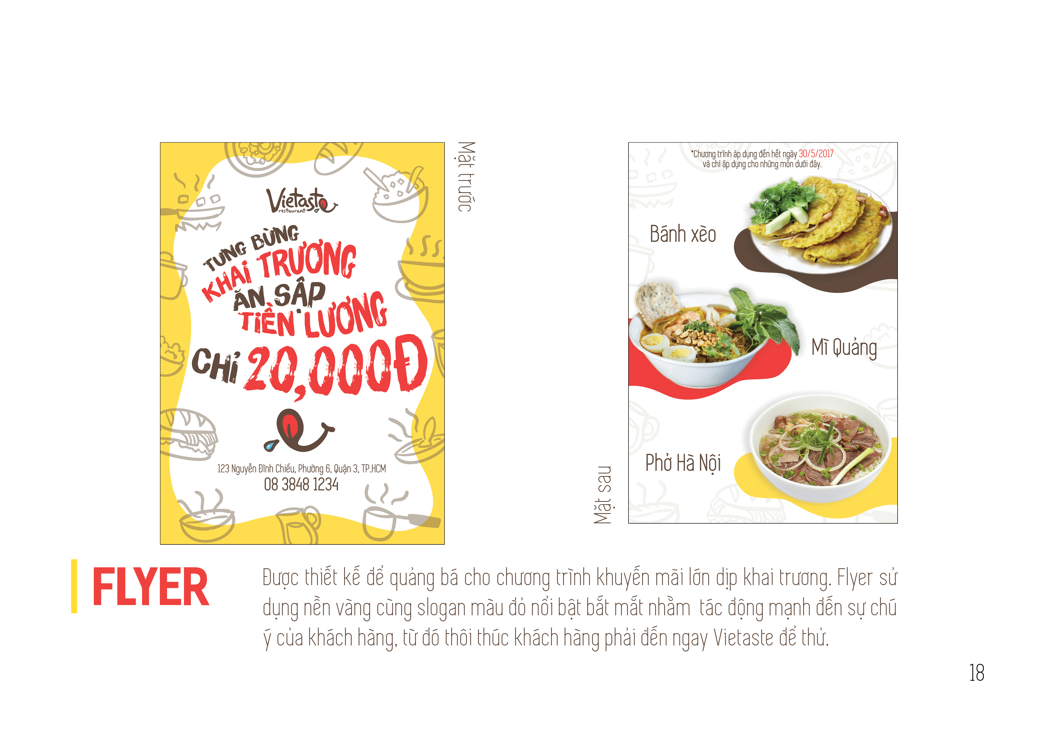
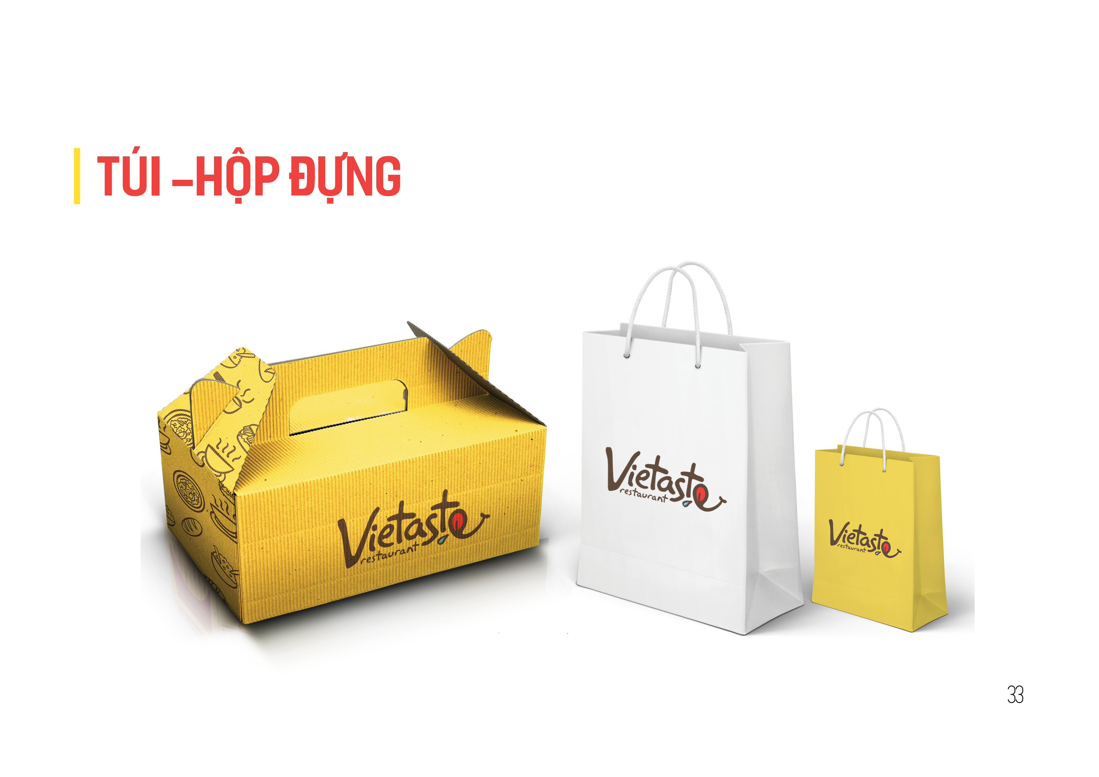
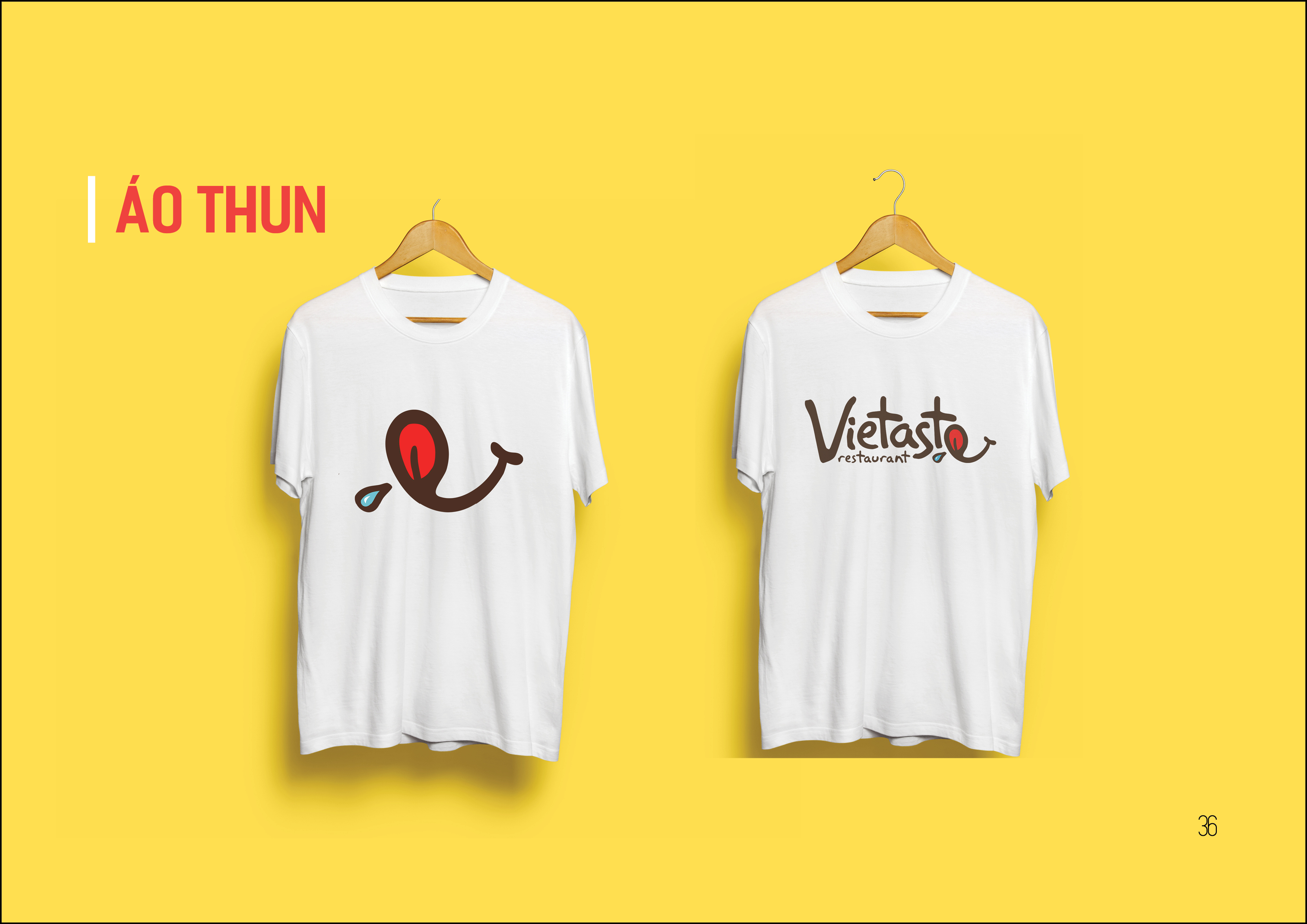
POSM
Reflection & Things to improve
The weakest part of this visual system was the typeface usage. We were too greedy to wrap up an appropriate typeface pack, but tried to combine many typefaces and fonts as we thought it would show tradition and modernity effectively.
The weakest part of this visual system was the typeface usage. We were too greedy to wrap up an appropriate typeface pack, but tried to combine many typefaces and fonts as we thought it would show tradition and modernity effectively.
Credits:
Brand concept: My Nguyen.
Visual system development: My Nguyen, Trang Tran.
Logo design: Trang TranPOSM design: My Nguyen, Nghia Nguyen, Trang Tran
Brand concept: My Nguyen.
Visual system development: My Nguyen, Trang Tran.
Logo design: Trang TranPOSM design: My Nguyen, Nghia Nguyen, Trang Tran