Fixness Magazine
Editorial DesignWriting
Context:
Healthy lifestyles have been developed into an everyone cultural norm in Vietnam thanks to the rise of social media. Besides the positive effect, it is noticeable that there are negative aspects of this trend, such as producing misconceptions about an ideal look.
Healthy lifestyles have been developed into an everyone cultural norm in Vietnam thanks to the rise of social media. Besides the positive effect, it is noticeable that there are negative aspects of this trend, such as producing misconceptions about an ideal look.

Fixness Concept
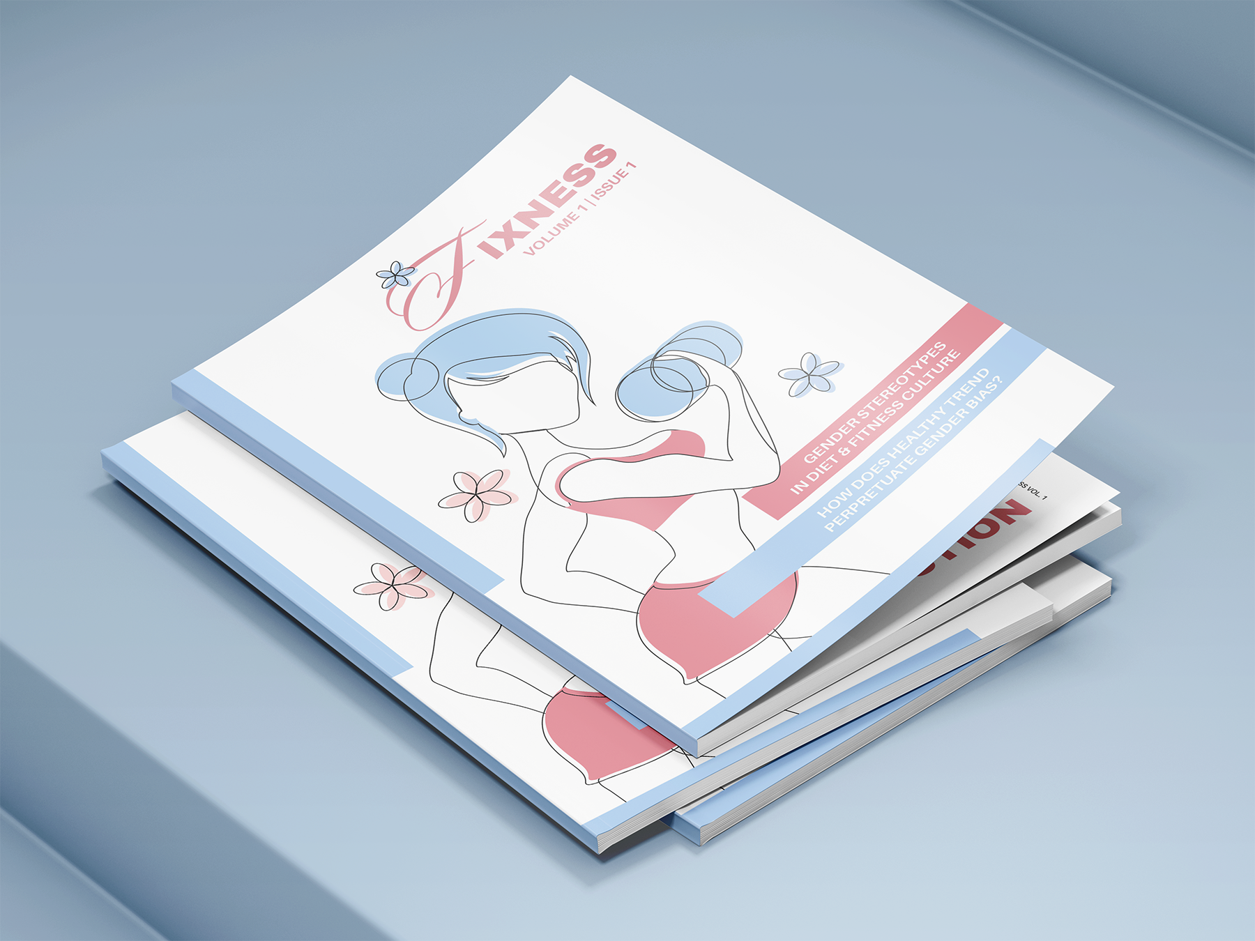
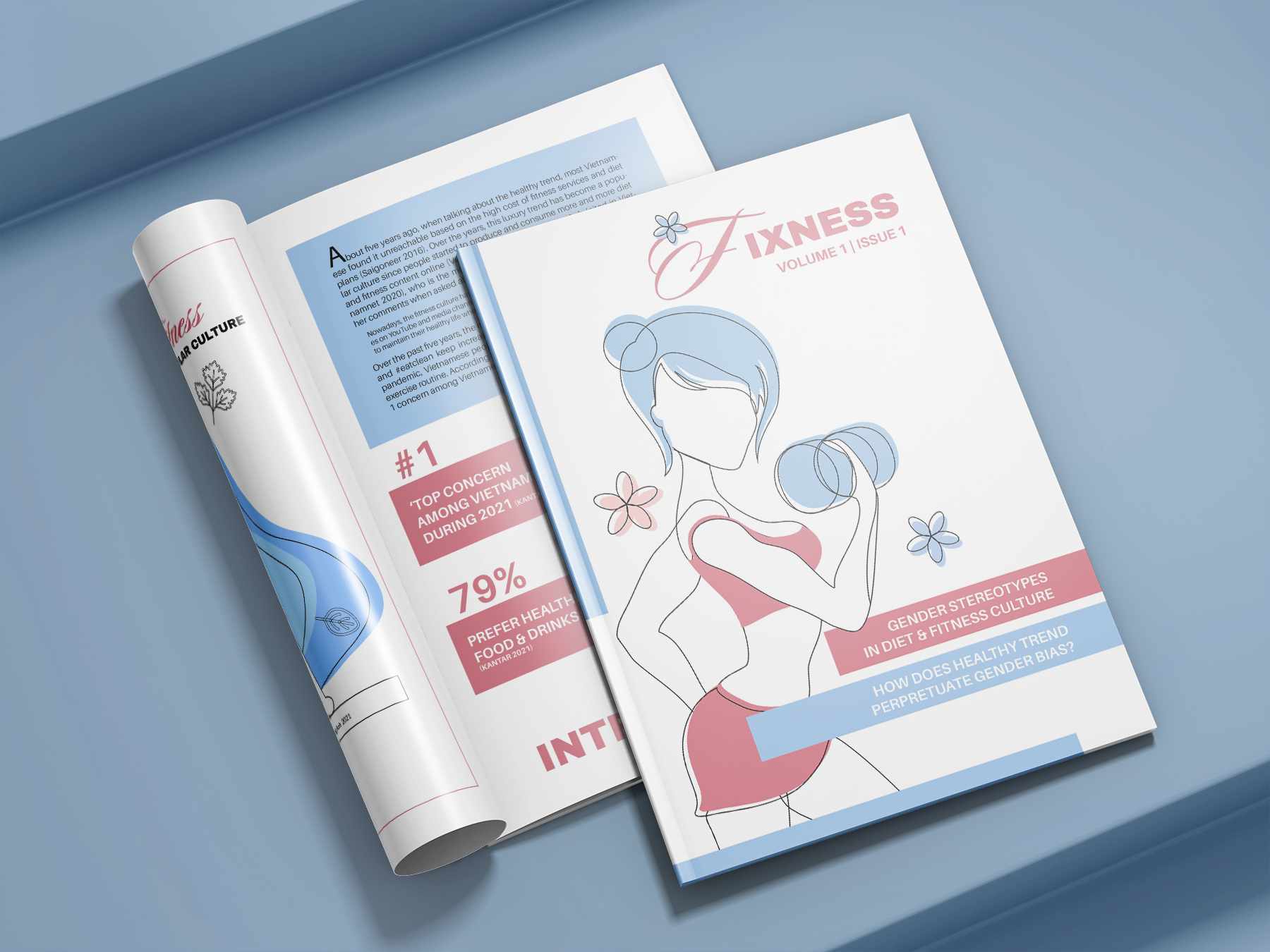
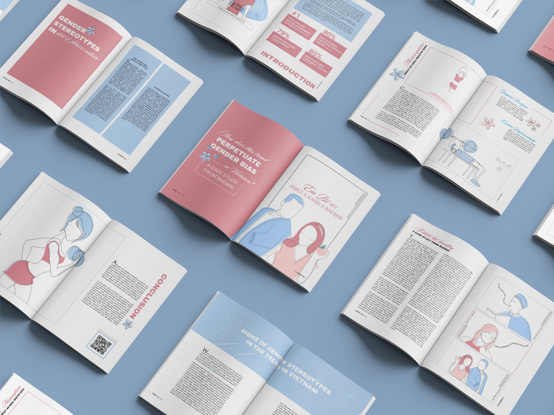
Fixness is a magazine that highlights “needed-to-be-fixed” issues in fitness culture.The emergence of this culture on social media has produced misconceptions about an ideal look for both sexes. Then, it may spread gender bias ideology to a large number of consumers.
Volume 1.1 of Fixness is going to explore the culture through the lens of textual analysis and gender performativity theory, and answer the question:
How does the healthy trend perpetuate gender bias?
Magazine Logo
The magazine’s logo is a simple wordmark that combines sans-serif and script typefaces. It depicts the contrast between resistance and vulnerability that can be investigated through this culture.
Using different fonts, these typefaces will also play a major role in the magazine layout design.
Using different fonts, these typefaces will also play a major role in the magazine layout design.
Magazine Design
Since this project focuses on article writing, I made the layout clean and minimal with line art illustrations.
The color scheme also gives a signal about gender stereotypes, where pink is told to be associated with girls and vice versa.
Click here to read the full magazine. ︎︎︎
Mockups by:
︎mockupfree.co on mockupfree.co
︎ Anthony Boyd Graphics on anthonyboyd.graphics
Thank you for visiting! ︎ Don’t forget to check out other projects. ︎︎︎